Text looking awkward next to your image? Leaving awkward white space near your cutout? It’s time to wrap! Text wrap is a common tool used in yearbook and newspaper layouts to waste less space on a page and make the images feel more like part of the design, since the text and cutout photos seem to “fit” perfectly, like puzzle pieces. It’s a great tool for making text look “less awkward” when it sits on a photo, emphasizing an image’s outlines. Read on to learn how to wrap text on your layouts in InDesign. How to Use Text Wrap in Adobe InDesign
- Define the area that you want to wrap text around. To do this tutorial, you will need two things: a block of text and an image or shape that you want to wrap the text around. If you don’t have any text, fill a box with placeholder text for the sake of this tutorial, just so you can see how the text fits around the object to adjust spacing later. Text wrap works well on rectangles, circles, or cutout images with transparent backgrounds. However, if you’re wrapping text around one element of a photo but you want other areas to remain in the background, you’ll need to draw a “ghost shape.” Designers often draw ghost shapes even for wrapping normal elements, since it helps to eliminate weird crevices that the text might try to flow into. To create a ghost shape: Select the pen tool. Follow the outline of the object you would like to wrap, leaving a bit of a gutter (unless you want to do that in the next step). Once you are done drawing this shape, set the fill and stroke to transparent. Now, just apply text wrap to this object!
- Click “wrap around object shape” in the text wrap menu.
Go to Window > Text Wrap to bring up the menu. With your object selected, click the third icon.

- Adjust the boundaries.
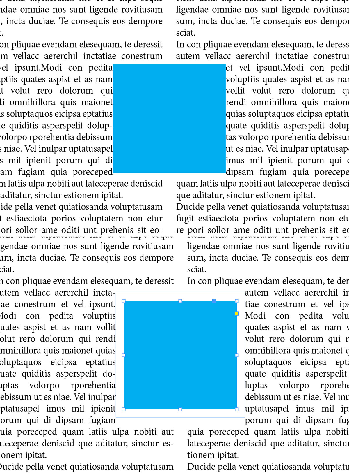
In the text wrap menu, you can make the wrap borders extend further from the shape by inputting a value in the boundary box. For irregular shapes, the boundaries must stay equal on all sides. However, for rectangles, you have the option of un-clicking the link in the middle to create a customized wrap boundary for each side.
 A boundary of 0p0 versus 0p5 (zero pixels versus five pixels).
 - Optional: choose certain objects to ignore the text wrap.
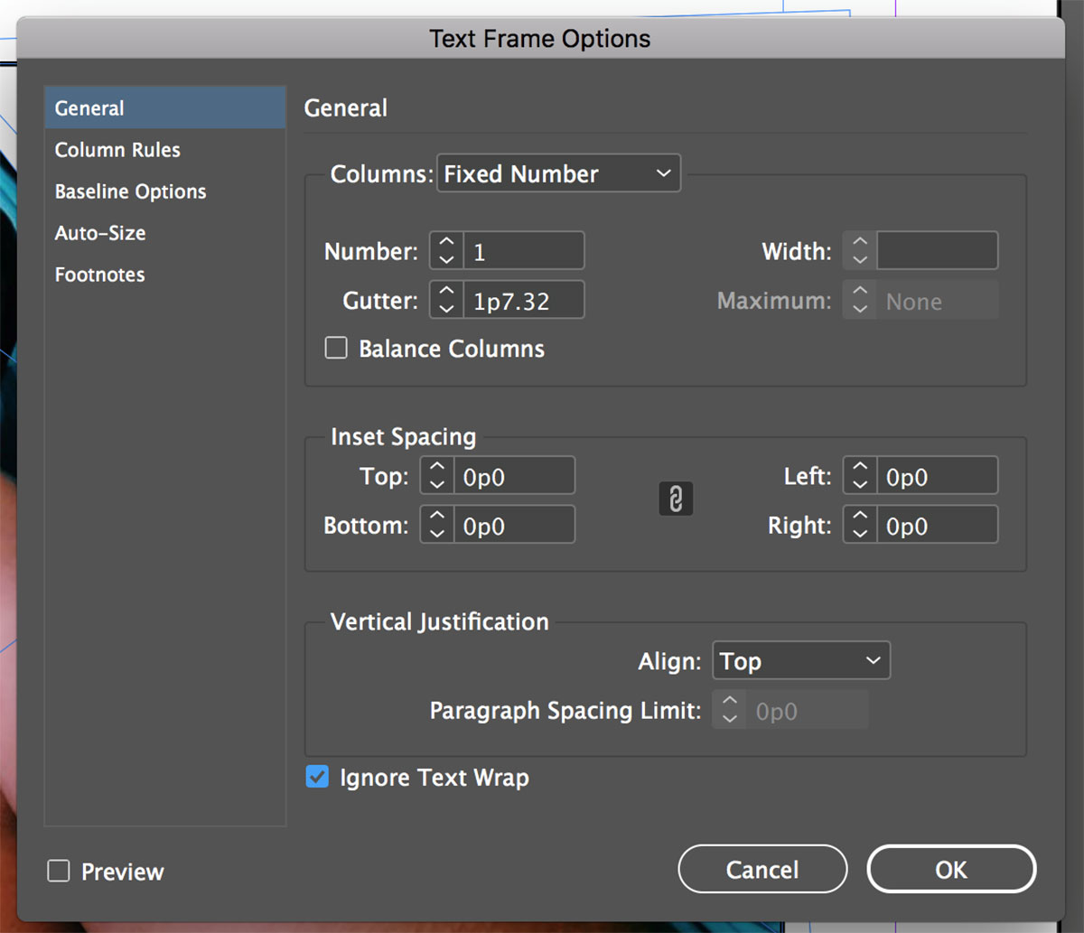
If you have title elements that overlap the wrapped object, you can turn on a setting that makes them immune to the text wrap. Just press ctrl/command+B to bring up the text frame options. At the bottom of this menu, check the “ignore text wrap” option.

You should have a completed text wrap! Still having trouble? See Adobe’s official guidelines for text wrap here. Thinking of using text wrap in a yearbook layout? Click here to learn how to design yearbook layouts on a grid. Are you a current student? See how you can save over 60%.


