

The brochure can seem initially simple, but a lot of thought actually gets put into organizing the specific content of each flap. Did you know that there are expectations of what belongs on each page of a brochure? Think about it: you see the title on the front, introducing you to the event, cause, or group. You open it, find a bit more information, and continue digging deeper. For this reason, the brochure is an inviting form of print design. If you are trying to provide more information than you could responsibly fit on a poster but don’t want to send people home with a boring one-sheet of text, a brochure is your ideal design form. Read on to learn how to create and organize a brochure in Adobe InDesign and designate information to each flap.
How to Make a Brochure
- Create a document with tri-fold guides.
In Adobe InDesign, create a new document. As long as you’re working with normal printer paper, you can select the standard paper size of 9.5 by 11 inches under the print formats menu. Make sure you hit “landscape” instead of “portrait.” For page number, type “2.”
Once the document is open, go to Layout > Create Guides. Create a three-column, zero-row grid so that you can see each of your brochure sections. Make sure you fit the guides to the page. The sections will have uneven amounts of space for content, since you have to leave a border for printing. However, you want your guides to line up with how a person would naturally fold the brochure!
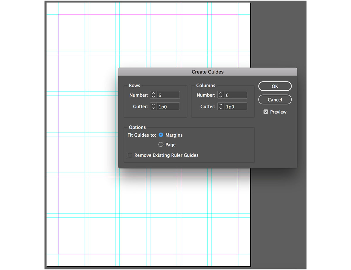 A screenshot of the guides menu
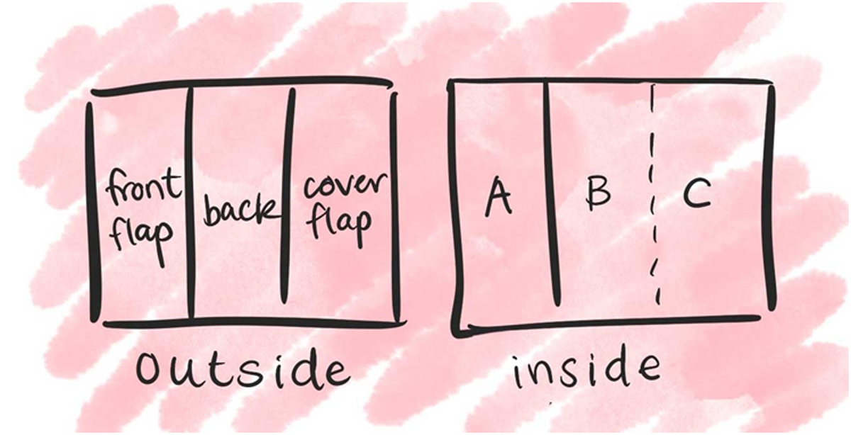 A diagram of the different sections of your brochure
 - Make a cover flap and keep it simple.
The “cover flap” section of your brochure is most important for drawing in an audience. You want it to be intriguing, well-designed, and fairly simple. Don’t overwhelm your reader with too much text. You probably only need to state the name of your organization, event, or topic, as well as provide one or two large images and a small amount of other necessary text.
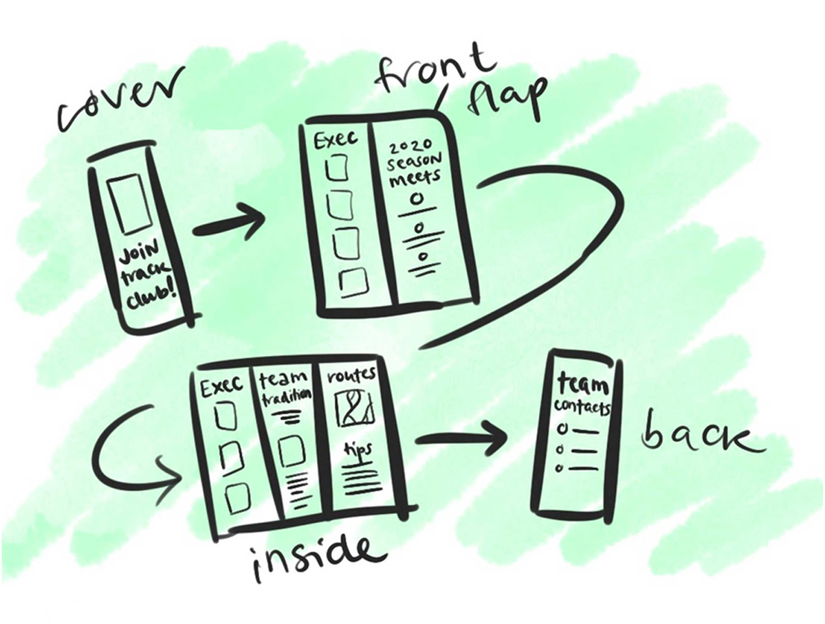 Idea #1 for how to organize a brochure’s information: Track Club.
 - Prioritize the important information on the first flap.
Since this is the first section that people read, it’s often used to introduce the topic and engage the reader.
Think: if someone could only know five things about this topic, what would they be? Summarize your most crucial information on the first flap. If they stop reading at this point, they’ll still have the most important text.
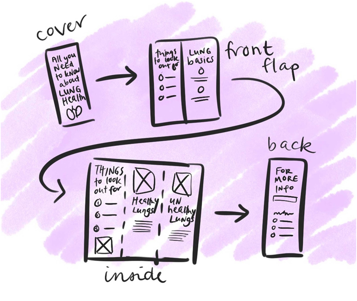 Idea #1 for how to organize a brochure’s information: Lung Health.
 - Get into details on the inside sections.
The leftmost side of your second page—the first inside section of the brochure, labeled “A” in the diagram—can be seen when you first open it. It’s usually the second place people look, after the first flap, so make sure the information there makes sense to read and learn without diving into B and C yet.
The B-C inside sections will only ever be seen together, so feel free to design something that bleeds between the two or has text flowing between the two. Often, these two sections will contain the most complicated, detailed information because there is the most space.
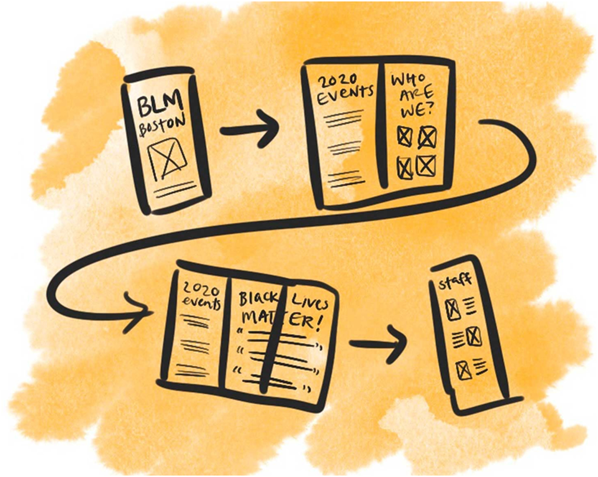 Idea #1 for how to organize a brochure’s information: Black Lives Matter Boston.
 - Leave contact information on the back. The back of the brochure is the last thing people read—and sometimes, they don’t read it at all! You can use this space to include contact information and any details necessary for people to follow up or learn more. Just like the front, focus on not overwhelming this space with too many elements. You want it to remain mostly simple so that people can flip the brochure over and quickly find the website link, phone number, or social media account handles. And just like that, you’re done! Make sure you print a couple test brochures to ensure text doesn’t overlap the folds.
Now that your group or cause has a brochure, you might consider starting an Instagram profile or twitter account! Click here to learn how to design social media posts with Adobe Spark. Are you a current student? See how you can save over 60%.