5 Knockout Presentations to Stun Your Professors
Adobe Creative Cloud has everything you need to take your presentations to the next level. Check out these creative examples and helpful tips for creating the best class presentation.
A good, eye-catching design can make a world of difference. Get creative with your next presentation, using Adobe Creative Cloud. You can bring your ideas to life with Adobe InDesign, or use one of the many unique, pre-made templates on Adobe Creative Cloud Express. Check out these creative class presentation examples.
Have a Consistent Theme
It’s important to have a visual theme that flows through the presentation. Your theme can follow anything from a color scheme to repeating shapes. When you keep the look and feel consistent, it makes the presentation visually pleasing.
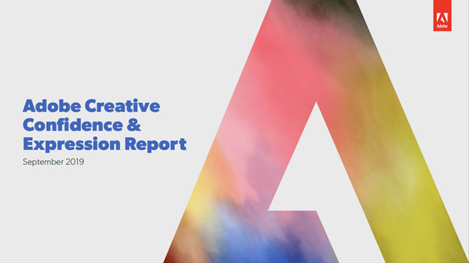
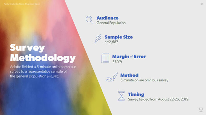
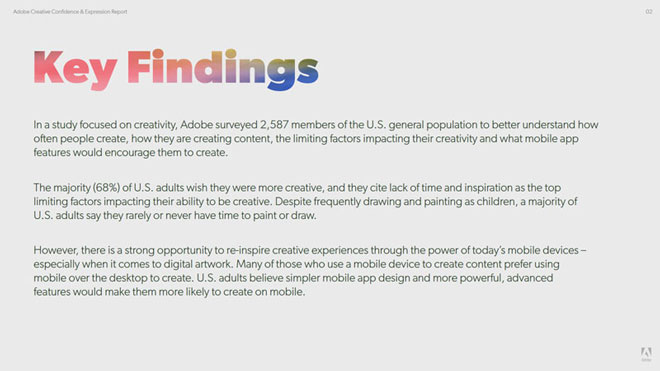
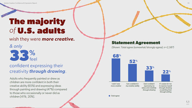
This is a great example of how you can get creative with how you connect your theme. See the full presentation here.
Get Creative with the Layout
Adding variety to your layouts is the perfect way to stay consistent without being bland. You can keep your theme, just switch up the arrangement. This will keep an audience’s attention and help the content stand out more.

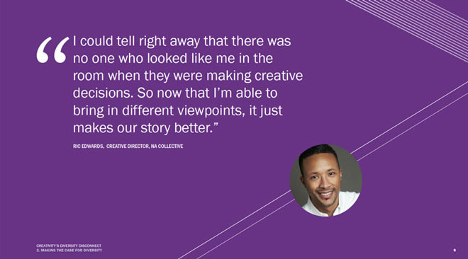

Let the content drive the layout. The above presentation does a great job at switching up the layout without losing the theme. See the full presentation here.
If you have a lot of data to share, consider creating an infographic to make it more visual and compelling.
An innovative way to step outside the norm and engage your audience is to build a website as your presentation. The information would flow by scrolling down the page vs. clicking through slides. Learn more about this practice with Creative Cloud Express (formerly Adobe Spark).
Keep it Simple
A clean, simple design is the way to go when putting together a presentation. You want to grab attention without overwhelming or distracting your audience. Limit text, and make use of bullet-pointed lists. When you fill your slides with high level content, your audience will focus on what you have to say. If your audience is busy reading a large paragraph, they’re probably not listening to what you’re saying. Your presentation should serve as a tool to reinforce the information you’re speaking about, not the other way around.


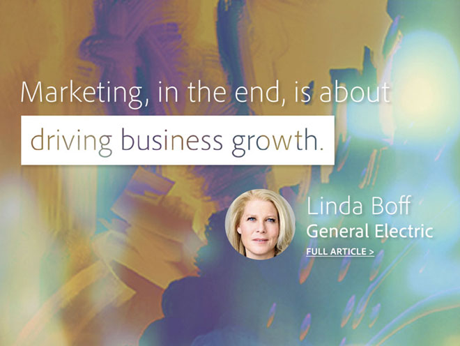
By making the main points stand out, your audience can quickly digest the information. See the full presentation here.
Incorporate Videos
Including visual elements like photos and videos can give your presentation that “wow” factor that keeps people intrigued. If you have a text-heavy presentation, this is a great way to offset it. Don’t have high quality photos and videos of your own? Adobe Stock has professional photos and videos for any topic or theme you could possibly need.

Learn how to add videos to a presentation with this step-by-step video tutorial.
Turn Your Presentation Into a Video
If you’re looking to really impress your audience, one way is to create a video presentation. Adobe Creative Cloud Express gives you the tools to create a simple, but unique video presentation.

A similar, but more engaging, concept is an explainer video. Using animation and voice overs, the video tells a story or explains a topic in a creative, engaging way. This may not be applicable to all presentation topics but, when done well, it will be memorable.
Adobe Creative Cloud can take your presentations to the next level, grab your audience's attention and stun your professors. And good news, students save 60%! Learn more at adobe.com/students.


