

Whether you’re creating a logo for an existing company or making a symbol to represent yourself, this guide to logo design can help. Logo creation is one of the most useful skills in graphic design. Learning how to represent a brand, person, or idea in a simple-yet-recognizable combination of icons and text is a daunting task, but it’s also fun and rewarding. You can even start making money on the side throughout high school and college by offering your logo design services. (Looking for more ways to monetize your design skills? Click here to learn how to make money using your design skills.) Maybe it’s your first time making a logo and you’re looking for a place to start. Maybe you’ve designed a logo before, but you’ve fallen into a rut of doing the same thing over and over again and need a boost of inspiration. Either way, we’re here to help. Let’s start with the number one tip for logo design: never delete anything! Every time you make a new revision, make a copy of what you already have so that you can go back to it later, if needed. To expedite this unending process of making copies, don’t bother using copy and paste. Just highlight all of the objects you want to copy, hold down your alt/option key, and drag on the screen to make a duplicate. Now let’s begin! How to Design a Logo
- Sketch out ideas. Before you hit the laptop running, take a moment to sketch out some logo ideas on paper or sticky notes. Whether you’re working with a client or creating something for yourself, think about the brand identity. What “voice” is this logo supposed to have? Should it be playful, serious, or futuristic? Play around with the way the letters interact on paper. You know you’re finished with this step when you have at least three ideas you’ve drawn that seem to have potential. Time to go digital.
- Type any text elements and play around with different font choices.
The typeface that you use to represent any words in the logo is one of the most important parts. Head to your favorite online font directory, like Adobe Typekit, Google Fonts, DaFont, or Font Squirrel and browse for different typefaces.
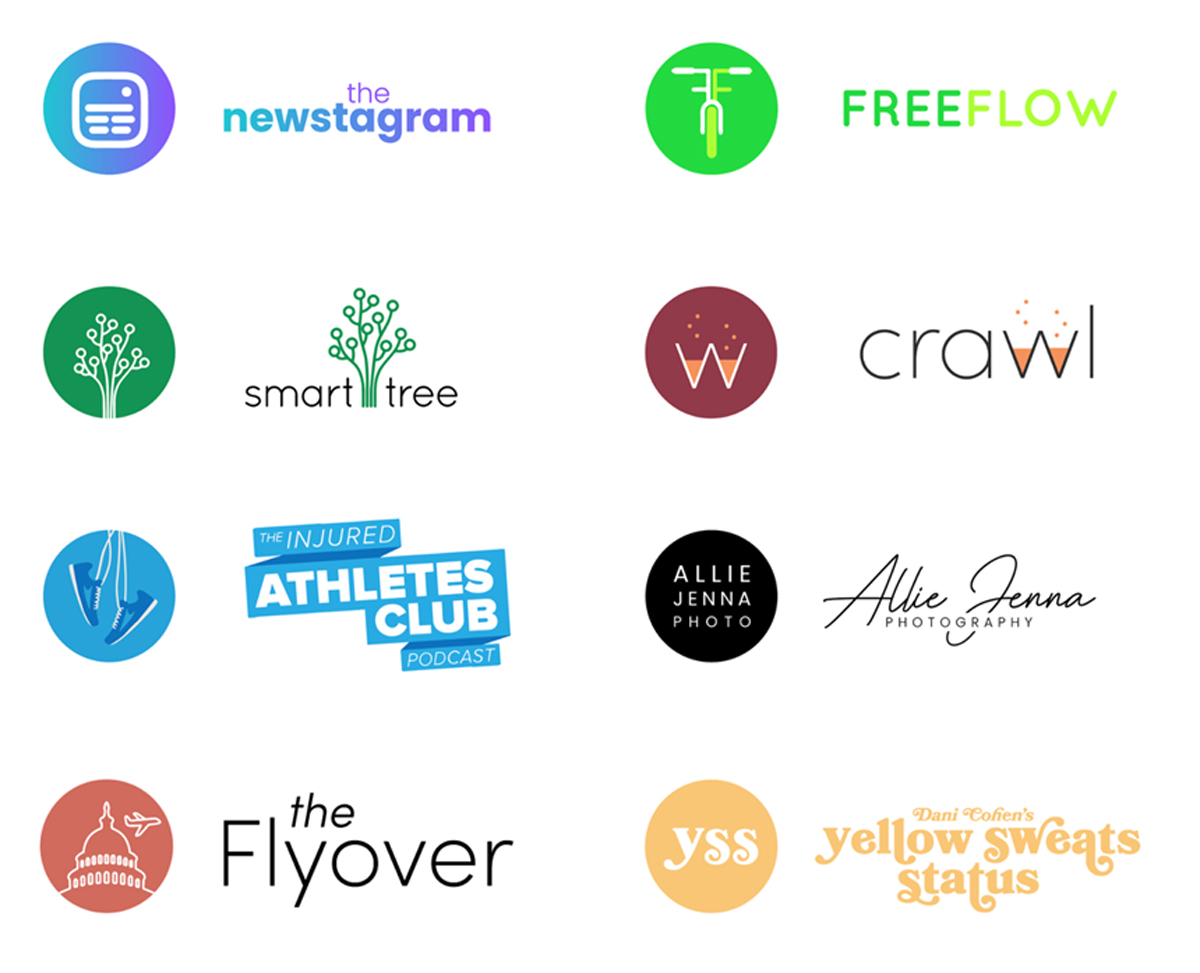 Logo designs from emmabianca.com. Notice how the different colors and graphic elements give off different feelings, even though the typefaces are similar!
 - Draw any vector elements using shapes and the pen tool.
The most basic logo format includes the name of the brand or group beneath a recognizable symbol, like the image shown below. There are obviously different approaches to take, but if you’re just starting out, this is a great place to start.
At this point, you should have a few different text options and some ideas bouncing around in your head. This is where it all comes together! Use the shape tools and pen tool to create unique vector elements. Feel free to convert your text to outlines (just go to Type > Create Outlines) if you want to manipulate the letterforms at all.
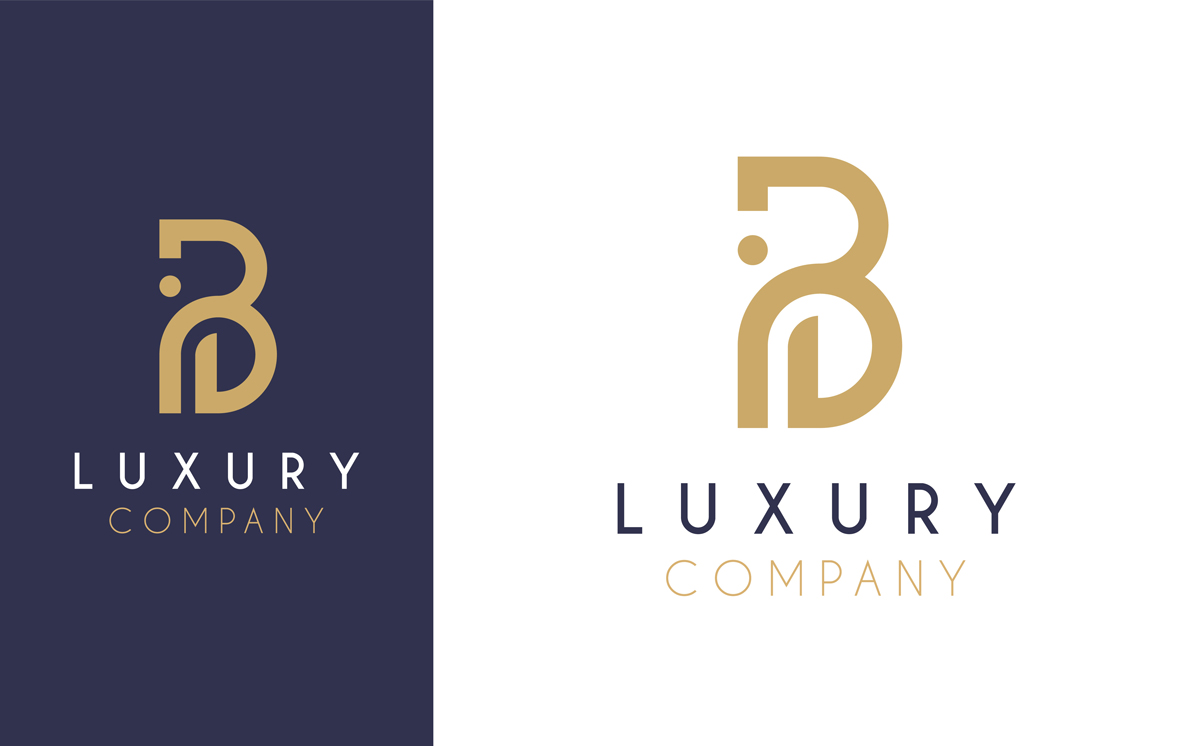 Convert text to outlines to start playing with letter shapes, like this “B”.
 - Experiment with different color combinations. A good logo has a strong, limited color palette. You probably only want to be using one or two colors. (Very few logos are able to get away with including more than three!) Keep in mind that your logo might have to be seen in grayscale, if anyone ever uses a black-and-white printer. A lot of logo designers create one-color versions of their logo to show what it would look like at its simplest. For these reasons, it’s actually in your favor to make something with less color! In this step, aim to choose colors that mean something. If you’re working with an environmental brand, opt for a shade of green or brown. For something playful, try yellow or pink. And for a trustworthy company, you can’t go wrong with red or blue. As mentioned above, keep playing around with ideas until you have three with potential. You can bring all of these to your client—or, if you’re making the logo for yourself, you can wait a couple days and see which one is emerging as a favorite.
- Create an icon version.
The biggest mistake you can make in logo design is creating something too complicated. A lot of logos are super simple. Some are even just a word. To test if you are falling into this trap, attempt to create an icon version of your logo. You can choose to show the most recognizable letter from the word (usually the first letter) or just an icon.
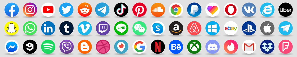 The icon versions of popular logos.
 - Return to the client...and expect revisions! Once you’re proud of a few ideas, it’s time to send them to your client. With something as important and permanent as logo design, you probably want to to have a couple rounds of revisions or edits before settling on a finalized design. Don’t be upset or offended when other people offer feedback! After all, this logo is going to be viewed by countless people, so having a lot of opinions and critique is necessary and realistic. Once you are finished creating your logo, be sure to save multiple versions. Use the export options in Illustrator to create a .png and .jpeg version. Then, add a black background to your document and create logo versions specifically for black backgrounds. You can export the icon version as well, and maybe even a couple different arrangements of the icon and text. The more options for your client (or yourself), the better! A logo is used in so many places that having different sizes is helpful. However, make sure the spacing and colors are consistent because you want the design to remain the same in all of its future uses.
Now that you have a logo, you can slap it on everything! Click here to learn how to make a unique laptop sticker or your own customized t-shirts. Are you a current student? See how you can save over 60%.